Have you ever walked into a home and felt like you’ve been hit by a big box store truck full of a single statement color? You open the door and it’s blue. All blue. Nothing but blue. And it’s all the exact same shade. I see blue and it’s everywhere, and it’s slightly terrifying.
We love blue just as much as the next person, but if you try to design around a single accent color it’s not difficult for your design to go into blue (or green or orange) overload. (Hey, guess what? That’s another reason why hiring a designer can be the key to your home renovation!)
So how do you carry an accent color throughout a home without it looking overwhelming, repetitive and just downright cheesy?
We’ve got some tips:
Vary the shades of your accent color
You want to start setting the stage for your design throughout the house when you first walk in — this goes for everything, including your accent color.
This is particularly key because so many homes today have an open concept or semi-open concept design, where the main entryway leads into potentially three or more other spaces, such as an office, dining room, kitchen and living room.
But setting the tone when you first walk in goes beyond just plopping a few pieces in the same shade of blue here and there. You want to set up a cohesive look from the start. That means really thinking through your design.
One of the keys to carrying color throughout the home is not using the exact same color but to use varying shades.
With Project Tulip, you can see how we focused on blue from the start, but we used different shades right away:
The entry space has a large turquoise ottoman that serves as a coffee table, but did you notice the artwork? Yes, the artwork is also predominantly turquoise but there’s several different shades of turquoise and blue, including a deep navy, embedded in the print.
This entryway flows into a dining room on the right, where we carried blue — this time focusing on a dark navy — into the design with upholstered dining chairs. But take a close look at the artwork in this room as well. Navy blue is the predominant color here but there are also lighter shades of blue in the artwork, including turquoise:
You might have noticed another color — or two if you have an eagle eye — in these two rooms. That’s by design and leads us to our next design tip.
Pair your primary accent color with other statement colors
It’s often not just one color that gets carried through a house, but multiple colors. This helps make your design not look like you’re walking into some big box store and buying the whole blue or gold or orange package.
With Project Tulip, you should notice two other strong accent colors in the entryway and dining room: Black and gold accents are carried throughout the two rooms. You’ll also see these colors in another adjacent room as well — the office, which is still anchored in blue with a navy blue office chair and a turquoise rug.
All three of these colors work well together — and not just when it comes to bruising your skin — and they are repeated throughout the home, from the kitchen with its blue island and gold hardware …
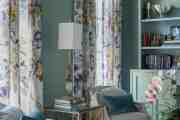
… to the living room with navy leather chairs and a turquoise rug. There’s also a very soft shade of turquoise in the window treatments in the living room.
In the guest rooms, there are touches of blue everywhere and even in one room that’s primarily orange, you’ll see we still tied it together with the rest of the house by using blue accents.
You’ll also notice some touches of pink throughout the house from real and faux flowers, the main artwork in the master suite and a pop of pink from a pillow in one of the guest rooms.


The key really is to mix it up and not just get overly saturated with one color but to blend them all throughout the house.
Bonus tip: It really helps bring the design together if you can find a piece of art or fabric that blends the two or three colors together, but it’s not a must-have.
Keep your other colors neutral
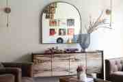
For Project Revere, it was all about the blue (yes, again) and this time the browns, a lot of times in the wood finishes, plus touches of gold that tied this project together.
And you’ll notice one designer trick: The pattern on the pillows in the living room are the same as the curtains.
But a big key to carrying accent colors throughout the house is to not go overboard — unless you’re a huge fan of all the colors, in which case have at it. For most clients, though, keeping the background neutral and adding the statement colors as accents works best.
In Revere, we have a lot of gray to offset the blue, brown and gold accents.
In Project Rive, we have grays and whites as a backdrop to dark blues and darker wood finishes.
Sometimes the accent colors are not even in the focal points. Instead of them taking up a lot of real estate, they can appear in the wood finish of mostly upholstered dining room chairs, the colors used in a piece of artwork and even decorative accents like vases. This ties everything together and really grounds the design.
Another great project that shows this concept is San Clemente. Here, the main accent colors were shades of blue and green, plus a touch of medium brown in the wood finishes.


But we also introduced another color — a splash of orange. And we set everything against a neutral background.
This blends the colors in a way that doesn’t feel like you went to a big box store. Your color choices should appear intentional, without hitting you over the head with a single repetitive shade of blue.
Want more great design tips? Sign up for our email list.